Conversion Research and Testing 1/2 – Review
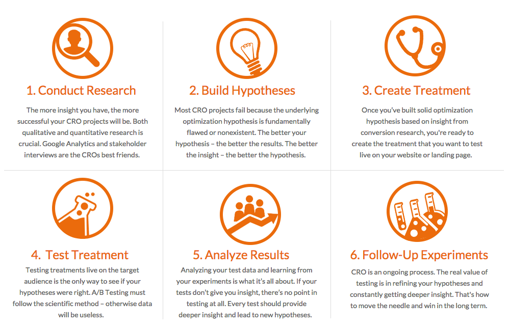
Conversion optimization is a process.
“If you can’t describe what you’re doing as a process, you don’t know what you’re doing. (William Deming)”
->Asking the right qustions leads you to a well structered and good conversion optimized website.
- Where are the problems?
- What are the problems?
- Why is it a problem?
- Turning known issues into test hypotheses
- Prioritizing tests an instant fixes
For all discovered insights, let your ego away and do not interpret false assumptions into the results of your feedbacks.
Instead categories and prioritize each issue, transalte into a test hypthesis. The ResearchXL model from CXL will assists you for an ideal approach.
For more details scroll down this article and let me you what you think in the comments at the bottom 🙂
Table of Contents
The ResearchXL Model
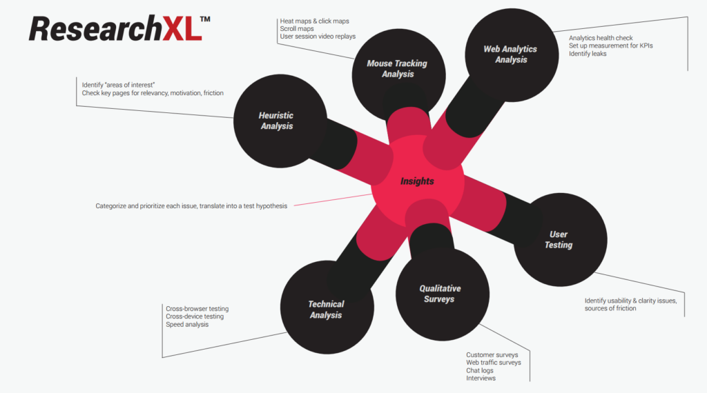
Step 1: Heuristic Analysis
- Clarity (Klarheit)
- Friction (Reibung)
- Anxiety (Angst)
- Distraction (Abkenkung)
“Heuristic analysis is an expert based analysis that uses experience-based techniques for problem solving, learning, and discovery. Its results are not guaranteed to be optimal.”
Step 2: Technical Analysis
- Cross browser testing
- Cross device testing
- Speed analysis
Good questions:
- Is shit broken?
- Where?
- Which browsers?
- Which devices?
- Which pages are slow?
Step 3: Digital Analytics
- Identify drop-off points
- Correlate behaviors with outcomes
- Fix measurements & verify data
Good questions:
- Where are the leaks?
- Which segments?
- What are users doing?
- Which actions correlate
- with higher conversions?
recommended tools:
- Google tag manager
- Heap – product analytics for proactive insights
Step 4: Qualitative Research
Surveys:
- On-site polls
- e.g. asking the user about their opinion about the website and which information they need to purchase the product which they offer
- Follow-up surveys
- e.g. after purchasing in online shop > email to customer about their experience and feelings about the checkout process
Good questions:
- Buyer groups
- Which problem are they solving?
- How are they deciding?
- What’s holding them back?
- What else do they want to know?
Step 5: Mouse Tracking & Form Analytics
- Heat mapping tools
- Record the clicks and mouse
- Scroll mapping
- Record how far they scroll upside down
- Video tracking
- How much they watch from a video
Good questions:
- Where do they click?
- How far down they scroll?
- Differences between devices?
- Session replays
Step 6: User testing
- Start by assigning a specific task to your user
- Bsp. find a pair of dark jeansin size 34 under 50 bucks
- Dont believe what they are saying but look what they are doing
Good questions:
- What’s difficult to understand?
- What’s difficult to do?
- What goes wrong?
What do after research?
Implement a useful system for prioritizing areas of concern along a five point scale
- Severe issues – 5 points
- Minor usability issues – 1 point
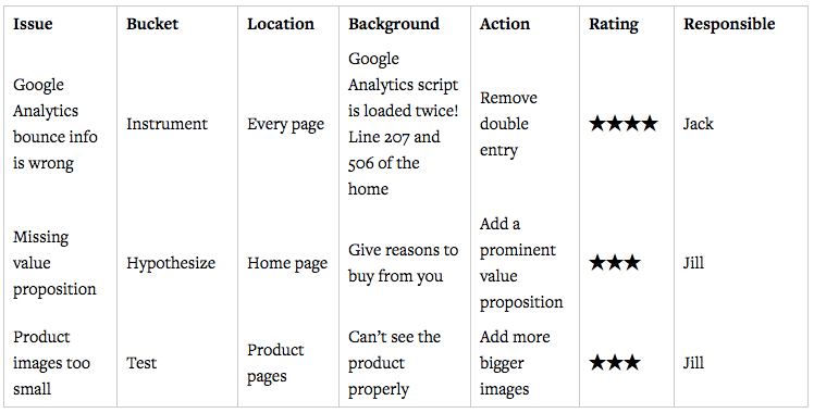
★★★★★ This rating is for a critical usability, conversion or persuasion issue that will be encountered by many visitors to the site or has high impact. Implementing fixes or testing is likely to drive significant change in conversion and revenue.
★★★★ This rating is for a critical issue that will be encountered by many visitors to the site or has a high impact.
★★★ This rating is for a major usability or conversion issue that may not be viewed by all visitors or has a lesser impact.
★★ This rating is for a lesser usability or conversion issue that may not be viewed by all visitors or has a lesser impact.
★ This rating is for a minor usability or conversion issue and although is low for potential revenue or conversion value, it is still worth fixing at lower priority.
There are 2 criteria that are more important than others when giving a score:
Ease of implementation (time/complexity/risk). Sometimes the data tells you to build a feature, but it takes months to do it. So it’s not something you’d start with.
Opportunity score (subjective opinion on how big of a lift you might get). This depends on how many users are exposed to the issue, and how close to the money the issue is. Let’s say you see that the completion rate on the checkout page is 65%. That’s a clear indicator that there’s lots of room for growth, and because this is a money page (payments taken here), any relative growth in percentages will be a lot of absolute dollars.
Measuring the Effectiveness of a Testing Program
- Testing velocity (Prüfgeschwindigkeit)
- Percentage of tests that provide a win
- Impact per successful experiment
When is the test done ?
- Enough sample size
- Multiple business cycles
- Statistical significance reached
TOP 12 TESTING MISTAKES
- Precious time wasted on stupid tests
- You think you know what will work
- You copy other people’s tests
- Your sample size is too low
- You run tests on pages with very little traffic
- Your tests don’t run long enough
- You don’t test full weeks at a time
- Test data is not sent to third party analytics
- You give up after your first test for a hypothesis fails.
- You’re not aware of validity threats
- You’re ignoring small gains
- You’re not running tests at all times
Metrics of a testing program:
- Number of variants tested
- Win rate
- Avg. uplift per successful experiment
Site Walkthroughs
- Does the site work with every major browser?
- Does the site work with every device?
- What’s the user experience like with every device?
What you need to do ?
- Walk through the site in question
- Make note of URL structure & handling
- Check page URLs when moving around (useful for measuring flows etc)
- Build a picture of site navigation flows
- Identify key points of interest for analytics: all the suspicious stuff should be checked later with data
- Find bad / suspicious pages or parts of the site
- Check if the URLs are shared/split for different flows (e.g. if the site sells 3 different products, do they have unique funnels – can each funnel be measured separately?).
Areas of interest:
Make sure that all key devices are tested – desktop browsers (and their different versions), tablets (iPad and Android), smartphones (various). When you choose which devices to test with, besides all iOS devices pick the most popular Android / Windows / Blackberry devices to test with. Check your Google Analytics mobile devices report to see what your audience is using. Note: the data is not perfectly accurate.
- Find PPC and organic routes for mobile, tablet, desktop. Walk the journeys starting with “landing page zero” – Google results, ads etc.
- Walk the three journeys – iPhone+Android, iPad+Android and a non-primary desktop browser (e.g. IE8)
- Walk the real journey, not the analytics data. It might be tempting just to check user flows within GA, but you need to experience the site as users do. It will be 10x more insightful.
- Is the journey part device centric or all device centric?
- Make a note of areas of interest for later
Benefits:
All the findings will be very practical: you get a series of prioritized fixes.
Easy wins! If you’re doing work for a client, getting quick wins early on helps you build a relationship while delivering client value
Duration:
Be ready to spend 1-2 days on this, depending on site and device mix.
Note: this is something you can outsource to technical people or even dedicated companies.
Heuristic Analysis
- Bias blind spot – the tendency to see oneself as less biased than other people, or to be able to identify more cognitive biases in others than in oneself.
- Confirmation bias is a tendency of people to favor information that confirms their beliefs.
-> Bias blind spot – the tendency to see oneself as less biased than other people, or to be able to identify more cognitive biases in others than in oneself. Confirmation bias is a tendency of people to favor information that confirms their beliefs.
The 7 Levels of Conversion by Web Arts
Web Arts uses 7 levels to assess each page:
- Relevance. Does my perception fit my expectations?
- Trust. Can I trust this provider?
- Orientation. Where should I click? What do I have to do?
- Stimulance. Why should I do it right here and right now?
- Security. Is it secure here? What if…?
- Convenience. How complicated will it be?
- Confirmation. Did I do the right thing?
Invesp Conversion Framework
- Build buyer personas and focus on a few select personas when designing your layout, writing copy and so on.
- Build user confidence, make them trust you by using all kinds of trust elements.
- Engagement. Entice visitors to spend a longer time, come back to visit, bookmark it, and/or refer others to it.
- Understand the impact of buying stages. Not everybody will buy something on their first visit, so build appropriate sales funnels and capture leads instead, and sell them later.
- Deal with fears, uncertainties and doubts (FUDs). Address users concerns, hesitations, doubts.
- Calm their concerns. Incentives are a great way to counter FUDs and relieve friction.
- Test, Test, Test.
- Implement in an iterative manner. Build smaller blocks, make smaller changes, and test them
MarketingExperiments Methodology heuristic approach

C = Probability of conversion
m = Motivation of user (when)
v = Clarity of the value proposition (why)
i = Incentive to take action
f = Friction elements of process
a = Anxiety about entering information
->Translation: The probability of conversion depends on the match between the offer and visitor motivation + the clarity of the value proposition + (incentives to take action now – friction) – anxiety. The numbers next to characters signify the importance of it.
LIFT framework
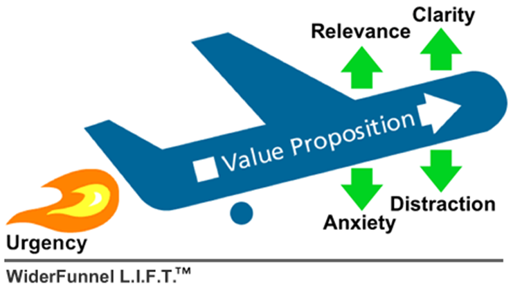
-> Relevance and clarity boost conversions while anxiety and distraction kill it.
Steps ConversionXL uses for heuristic analysis
- Assess each page for clarity – is it perfectly clear and understandable what’s being offered and how it works? This is not just about the value proposition – it applies to all pages (pricing, featured, product pages etc).
- Understand context and evaluate page relevancy for visitors: does web page relate to what the visitor thought they were going to see? Do pre-click and post-click messages and visuals align?
- Assess incentives to take action: Is it clear what people are getting for their money? Is there some sort of believable urgency? What kind of motivators are used? Is there enough product information? Is the sales copy persuasive?
- Evaluate all the sources of friction on the key pages. This includes difficult and long processes, insufficient information, poor readability and UX, bad error validation, fears about privacy & security, any uncertainties and doubts, unanswered questions.
- Pay attention to distracting elements on every high priority pages. Are there any blinking banners or automatic sliders stealing attention? Too much information unrelated to the main call to action? Any elements that are not directly contributing to visitors taking desired action?
- Understand buying phases and see if visitors are rushed into too big of a commitment too soon. Are there paths in place for visitors in different stages (research, evaluation etc)?
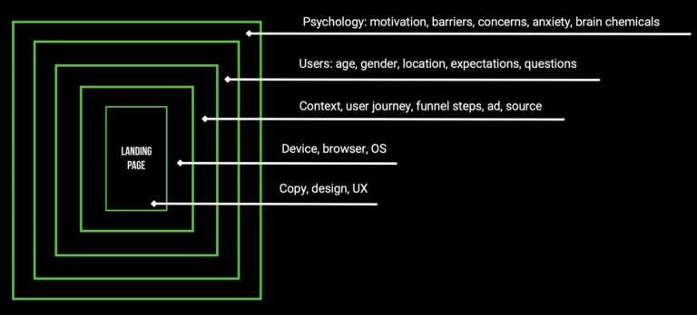
Relevancy:
Relevancy is a key factor determining your conversion rate.
Evaluate your top landing pages, and assess them for relevancy – especially if you’re driving paid traffic to those pages.
Ask questions like:
- Does the headline match the page content?
- Do call to action buttons match the value they’re going to get?
- Are the images on the page relevant to the content?
- If the user came from an external site (Google search, PPC, referral etc), will they recognize that it’s a continuation of their journey?
Bring in relevant traffic:
- Map out all the key sources of traffic, and identify the top landing pages for each.
- Compare pre-click and post-click messaging and visuals.
- Identify any mismatch between what people thought they’re going to get and what they’re actually getting in terms of the offer and the wording of the offer.
Evaluating clarity:
There’s design clarity and content clarity.
The best way to go about content clarity is to assess whether you could *instantly* answer the following questions on any page (especially if it’s a page where a lot of people land on via search or other sites):
- Where am I? What is this page about?
- What can I do here?
- How is it useful to me? Why should I do it?
- Can I understand what the product / service is, and how it works (in a reasonable amount of time)?
- Are there supporting images and/or videos that help me understand it?
- Is the product information adequate / sufficiently thorough for making a decision?
- Are all important associated pieces of information clear (pricing, shipping info, warranty, return policy etc)?
- Is it clear what I have to do next?
Evaluating design clarity:
- Is there strong visual hierarchy in place? Does it follow a most wanted action?
- Are less important things also less important design wise?
- Is there enough white space to draw attention to what matters?
- Are the visuals in place that support the content?
- Does call to action stand out enough?
- How much top priority information is below the fold?
- If there’s more information below the fold, is it clear that they should scroll? Any logical breaks that stop the eye flow?
- Is the eye path clear?
- Is the body copy font size large enough for easy reading? In most cases the optimal size is 16px, but that depends on the font.
Friction:
- Asking for sensitive information. The more personal you get, the less people will feel comfortable sharing. If you can, do not ask for their SSN, phone number, personal life questions.
Distraction:
- Are there any moving, blinking elements such as banners, automatic sliders?
- Which elements on the page are NOT contributing to people taking most wanted action? How many of them could be distracting?
- What could we remove from the page without compromising its performance?
- In the checkout (conversion funnel) pages, are there navigation elements that could be removed?
- Is the top header compact, or is taking up too much valuable screen space?
- Are there visual elements of lesser importance high in the visual hierarchy?
- Is there copy that is not about the specific action we want people to take?
Motivation and Incentives
- Is there a clear, benefit-driven offer?
- Do I understand WHY I should take action?
- Are features translated into benefits?
- Is it clear what people are getting when they click a button / fill a form? Is it something that’s desirable / useful for the target audience?
- Is there enough product information?
- Is the content interesting? Does it use simple language?
- Is the sales copy persuasive?
- Could we apply some persuasion principles here that would be a good match, such as social proof, urgency or scarcity?
Buying Stages
- Awareness – when a customer first becomes aware of your product. Or could also refer to the point where a customer first becomes aware of a need that they want to fulfill.
- Consideration – when a customer starts evaluating solutions to their need.
- Purchase – people are ready to spend money.
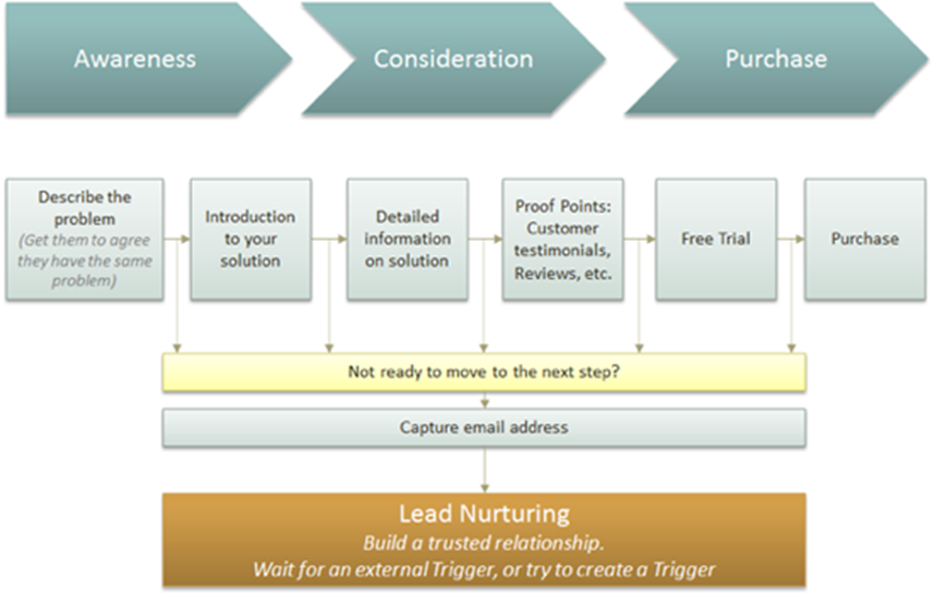
Questions to assess consideration for buying stages on a website
- If the user is not ready to buy, do we help them in their research and evaluation process?
- Are there secondary calls to action to learn more about the product in the key funnels?
- Is there an effective email capture process? Does it have a proper lead magnet?
Email capture is important
Use cases, case studies, customer success stories, product comparisons, etc. all help to provide the data and info that a prospect looks for in their own research. If you provide it for them you make it easy for them to consume that info and move to the step in the process.
0